Overview
As a college student, part of the beginning-of-semester experience includes buying textbooks for your classes. Between deciding whether to take four or five classes and last-minute shopping period anxiety, the beginning of the semester can be an overwhelming time—as such, it would be great if the textbook buying process could be as streamlined as possible.
In this project, I redesigned the textbook buying workflow on the Brown Bookstore website, the main online portal through which Brown University students purchase their textbooks every semester, in five wireframes, one high-fidelity mockup, and a responsive website prototype. Using a redesigned workflow and a cleaner interface, I attempt to demonstrate that while the textbook buying process can be difficult, there are ways to make it significantly easier for users in the long-term.
Design Analysis
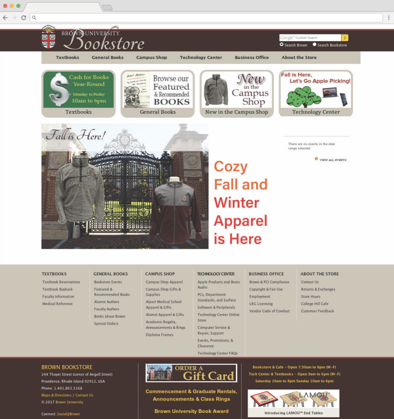
Currently, the Brown Bookstore has a somewhat less-than-stellar design:

While the whole workflow of the website works in the present, it’s clear from both a usability and design perspective that there are substantial changes that could be made.
Mockup Journal
To detail my thinking process during my redesign, I created a design journal analyzing each of the main website pages in the textbook buying workflow from a usability standpoint. Additionally, the reverse side of each page shows my concept mockup for a better page structure for each of the main views and arguments for why each mockup solves the usability problems of the original.
All of my design decisions were informed by a single idea: I wanted to move the focus from the actual textbooks to the specific courses that students take.
Why is this a good strategy? It’s less convenient for students to have to search for their textbooks by name since they have to find a course syllabus and look for the name of the required textbooks (if any). This is an unnecessary layer of complexity since teachers register their books directly with the bookstore, so the bookstore should be able to tell students what books they need based on the course. (Students are more likely to remember the names of the class they’re taking than the actual books.)
Redesigned Workflow
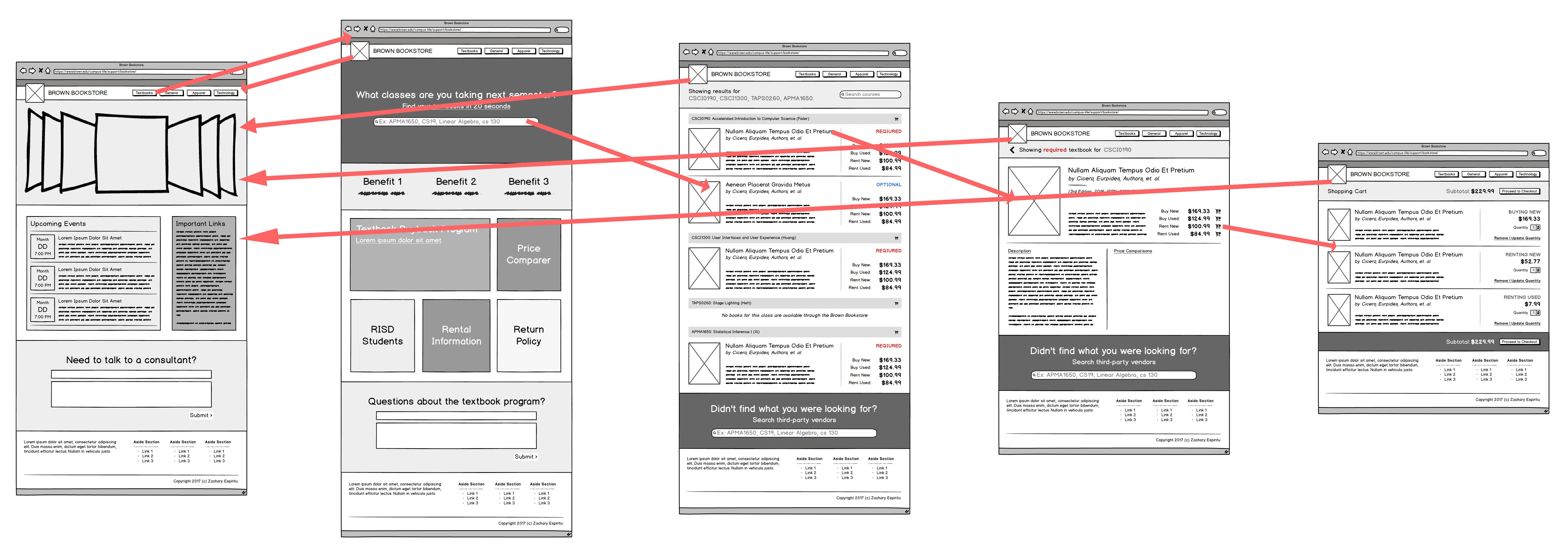
Using my redesigned wireframes, I created the following simplified workflow for buying a textbook from my version of the Brown Bookstore:

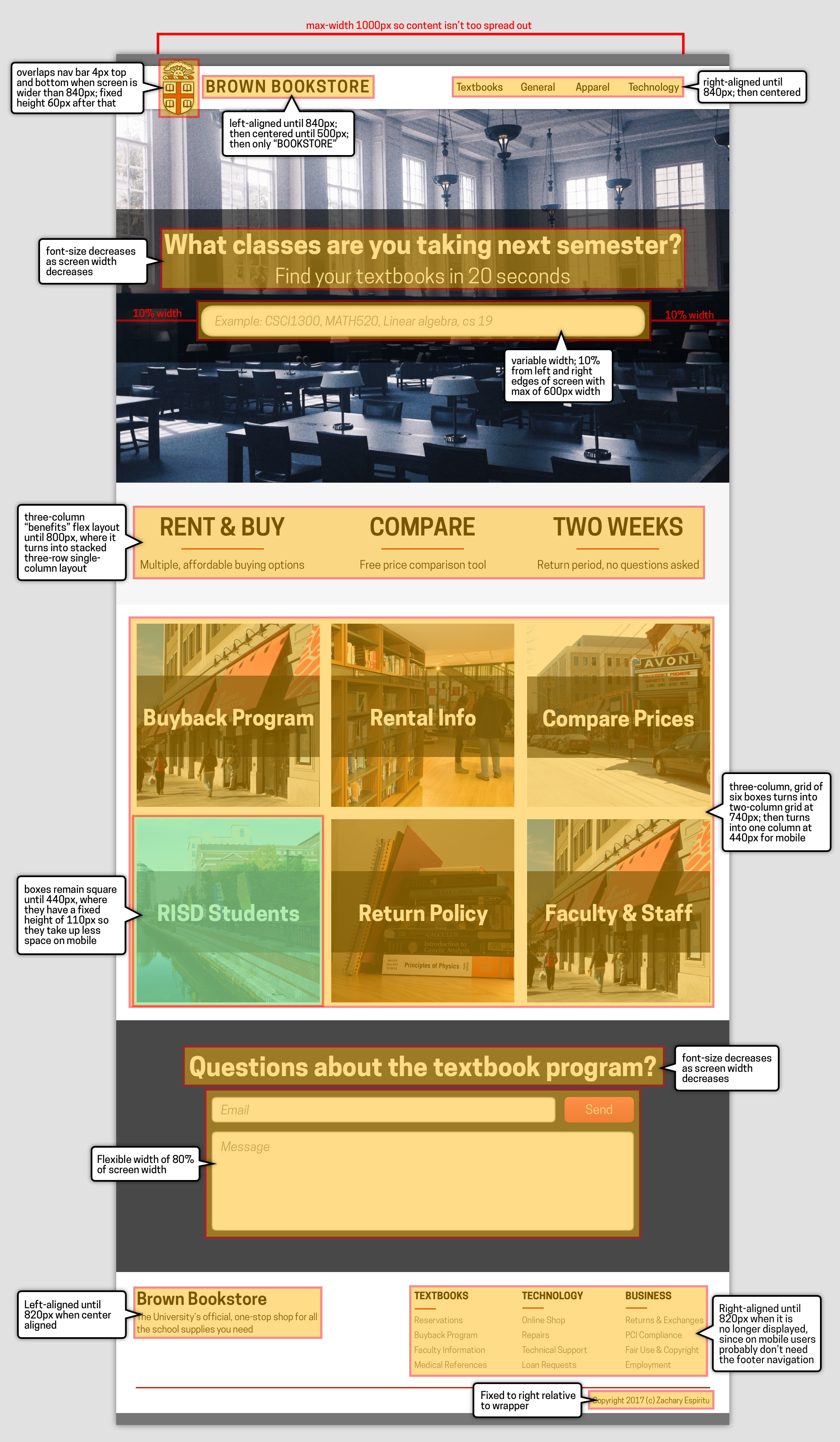
To expand on my designs, I took the textbook landing page mockup I created and expanded it into a high-fidelity mockup. Since the original website did not have a responsive design, I also wanted to make sure I was keeping smaller devices in mind as I was creating my prototype. As such, I added annotations to my mockup as I created it to describe how it would change based on changing screen sizes and device types.

Prototype
As a final step, to demonstrate that the high-fidelity mockup was possible to implement, I developed my own version of my final website which can be found at this link.
